
Where Information Meets Inspiration
Businessname: ParagonCare
Keywords: Modern, Clean & within Brand Guideline
What I did: Editorial Design, Redesign of Layouts and Logo
Business Type: Pharmaceutical and medical company
At ParagonCare, I had the opportunity to work within a major pharmaceutical and medical distribution company operating not only across Australia and New Zealand but also in markets such as Indonesia, Vietnam, Philippines, Thailand, Korea, and Japan.
Within my time as a part of the marketing and graphic design team, one of my main jobs was to take care of editorials e.g. seasonal as well as the monthly product catalogues called The Oracle for ParagonCare Complementary Medicine. I also designed and redesigned customer and practitioner brochures and booklets for medical and educational events. These publications not only had the purpose to deliver informations about the newest trends or technologies but also to inspire and to learn more about a healthy lifestyle or to help your brand grow within the medical and pharmaceutical sector.


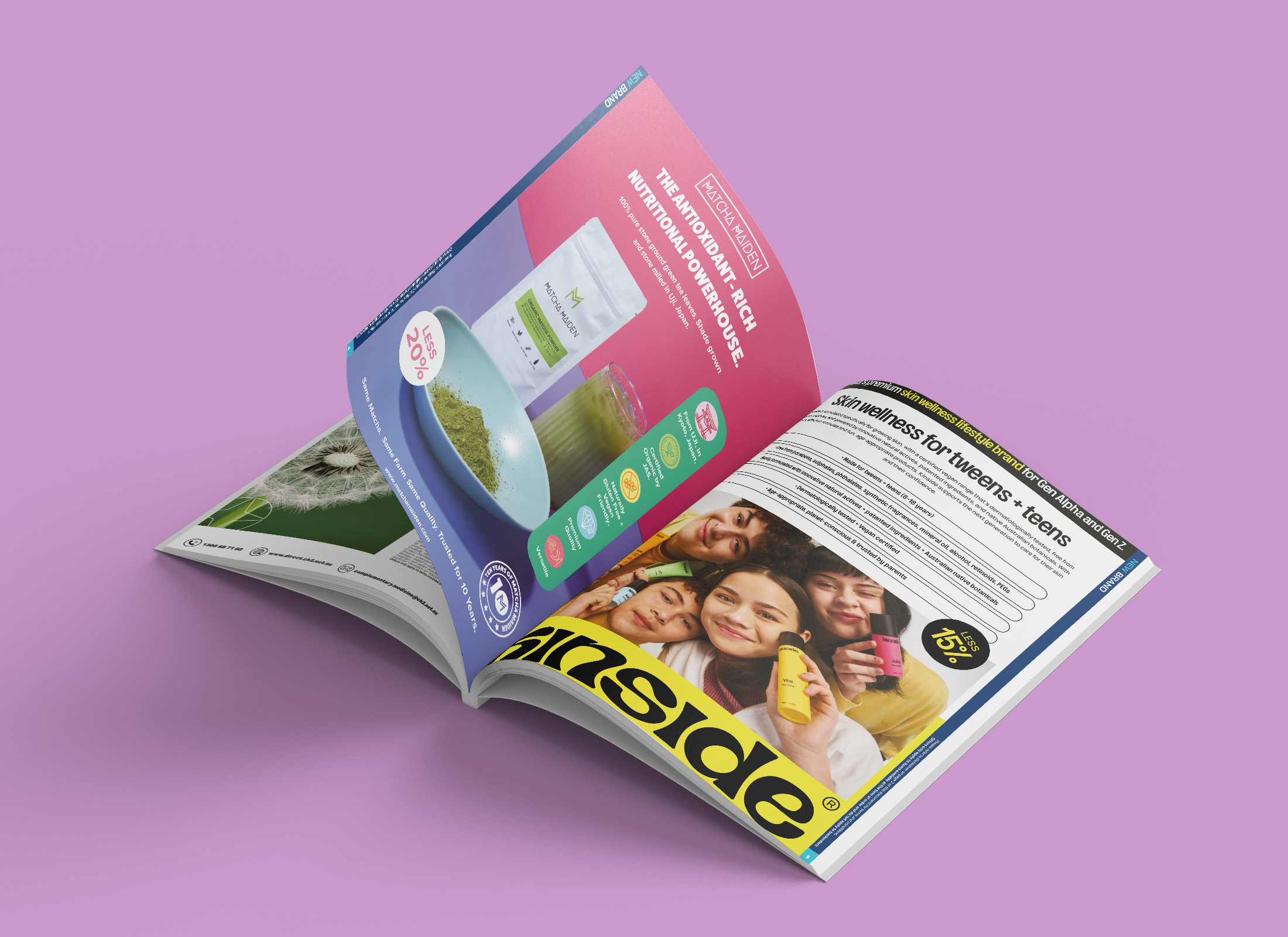
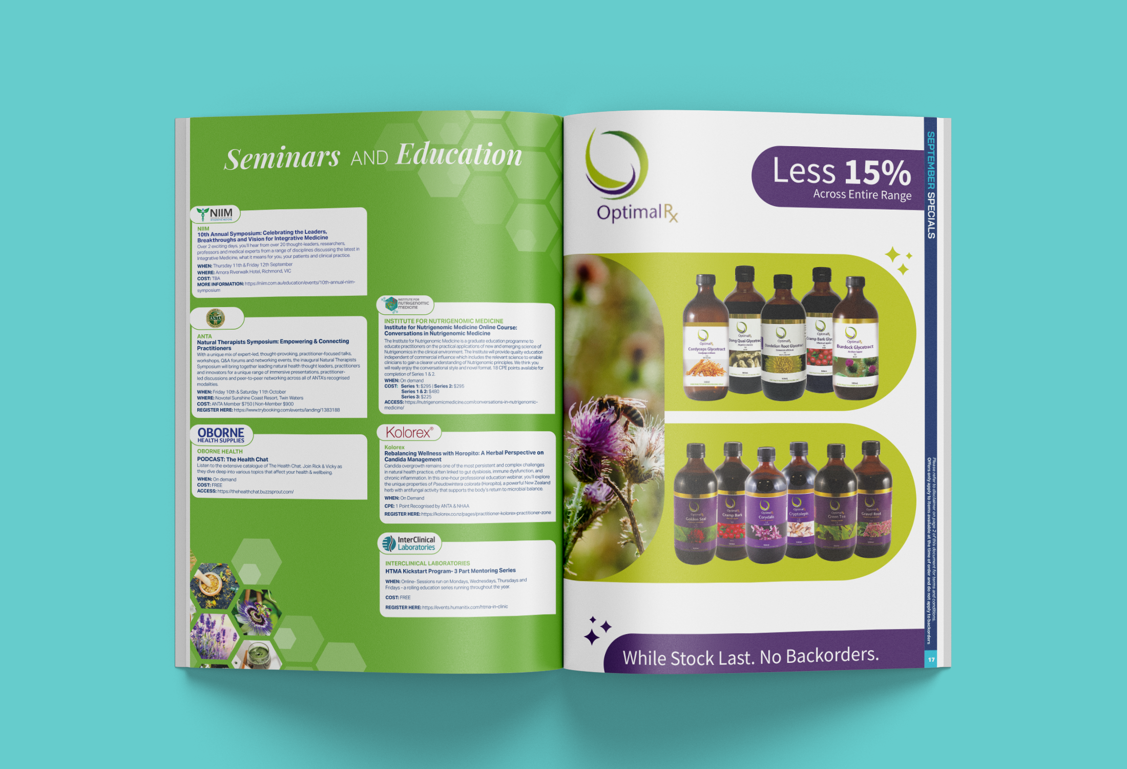
The Monthly Oracle to Wellness & Inspiration
The Oracle is a monthly publication dedicated to keeping customers informed and inspired about the latest in complementary medicine, health, and lifestyle. Each issue showcases new brands and products alongside educational events for practitioners, with a strong focus on supplements, natural and organic alternatives, beauty and wellness, children’s health, and feel-good essentials. More than just a catalogue, The Oracle is designed to spark curiosity, promote healthier choices, and highlight regional brands that complement conventional medicine.

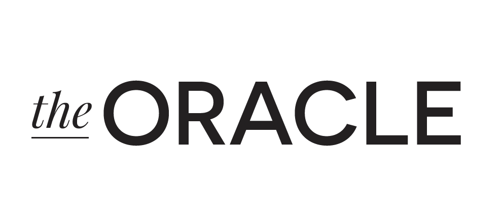
A Fresh Take on a well-known Logo
The Oracle logo was redesigned by me to move away from the dated blue gradient design, which often clashed with imagery and felt visually heavy. The new wordmark takes a clean, timeless approach with refined typography and a confident black and white palette, ensuring maximum versatility across print and digital applications. By minimising unnecessary effects, the redesigned logo allows the publication’s content and imagery to shine, while projecting a modern, professional identity.
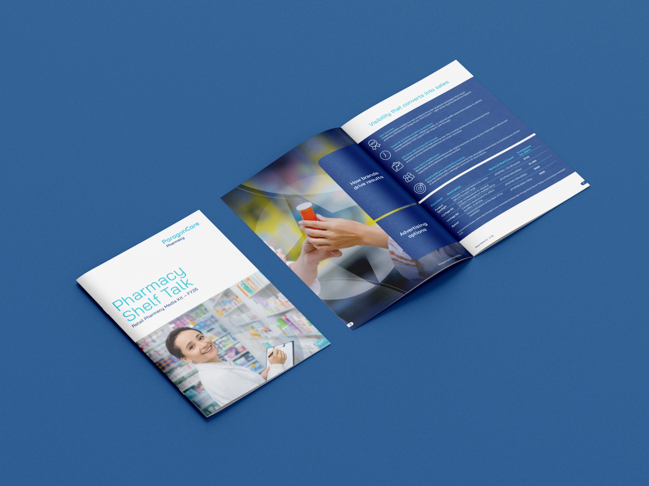
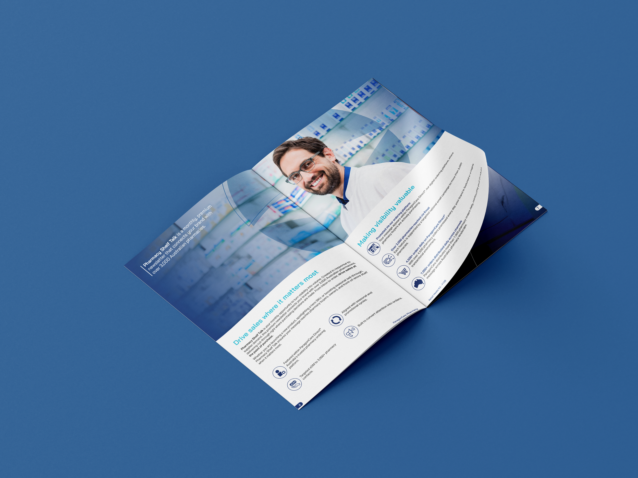
The Pharmacy Shelf Talk booklet was developed as a practical publication for practitioners, helping them navigate and select the right model featured in ParagonCare’s newsletter and in the ParagonCare Online Shop. Unlike the more lifestyle-oriented complementary medicine catalogue, this design leans into a clean, highly corporate and informative style, staying true to the brand guidelines and the overall structured style ParagonCare is known for. Subtle creative elements such as custom icons to point out text sections and transparent star overlays on imagery throughout the booklet were introduced to highlight key figures like pharmacists and products, adding depth and focus while keeping the overall layout professional and accessible.
By including this smaller editorial design for this booklet, I wanted to showcase the variety in my work. From clean, minimal layouts within strict brand guidelines to more playful designs that are used within a complete different marketing target but are nevertheless not boring at all.

